Colour schemes
Fourteen sets of colours, each with a light and a dark version.
Choosing one
[params.style]
  scheme = "nord"
Without a scheme, the preset’s own is used. Any scheme goes with any preset.
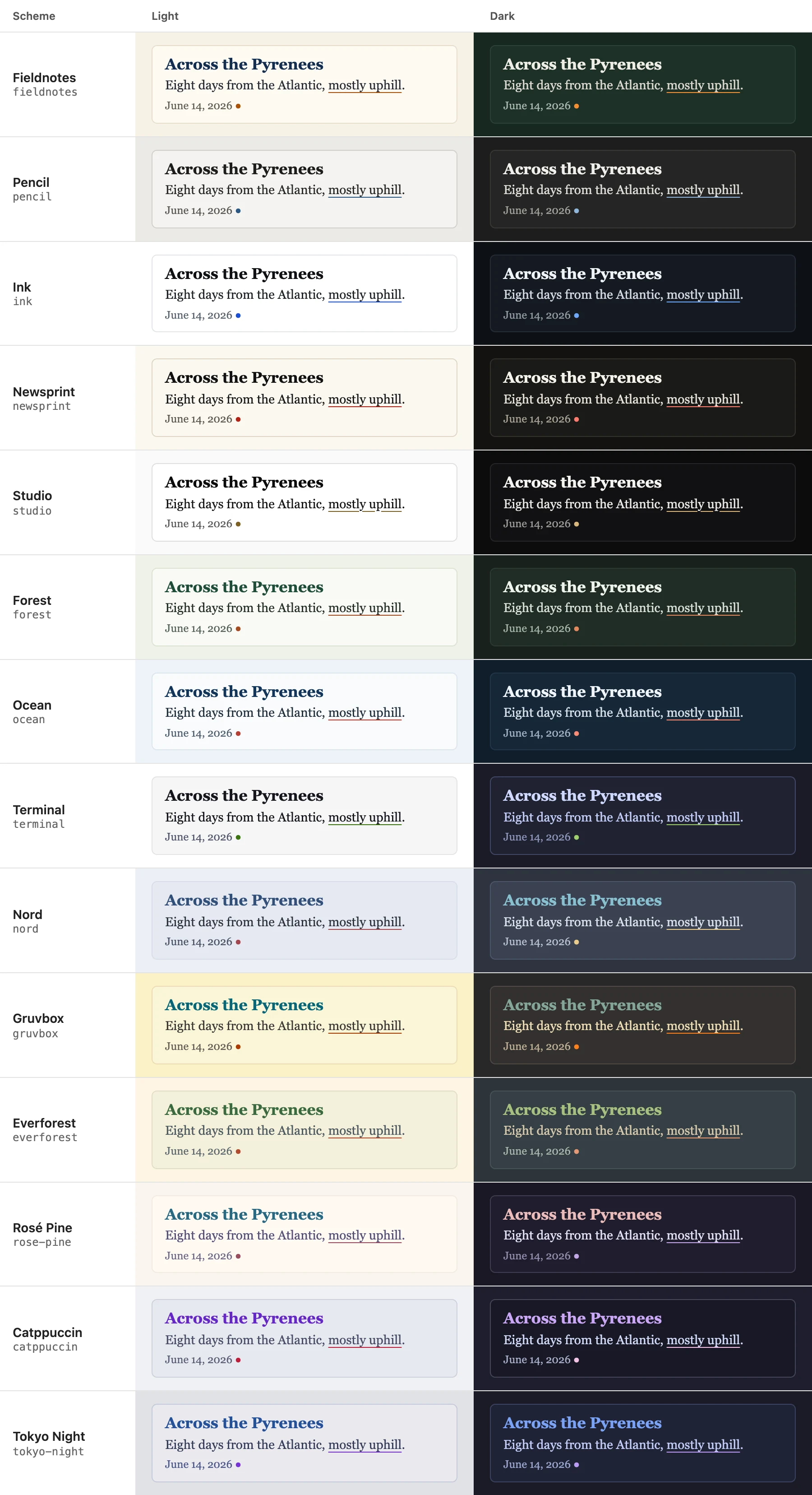
The fourteen
The theme’s own first, then popular editor themes. In each, all text reaches a contrast of at least 4.5:1 on the page and on cards (WCAG AA); where an editor theme’s original light colours fall short, they’re a little darker here.
| Scheme | Light | Dark |
|---|---|---|
fieldnotes | warm paper, blue-black ink, an orange accent | dark green with chalk-white text |
pencil | light grey, graphite, a blue accent | dark graphite |
ink | white, near-black, a blue accent | blue-black |
newsprint | cream, black, a red accent | warm near-black |
studio | neutral white, a muted gold accent | neutral black |
forest | pale sage, dark green, a rust accent | deep green |
ocean | pale blue-grey, navy, a coral accent | deep navy |
terminal | white, near-black, a green accent | dark blue-grey with green |
nord | Nord’s Snow Storm | Nord’s Polar Night |
gruvbox | Gruvbox light | Gruvbox dark |
everforest | Everforest light | Everforest dark |
rose-pine | Rosé Pine Dawn | Rosé Pine |
catppuccin | Catppuccin Latte | Catppuccin Mocha |
tokyo-night | Tokyo Night Light | Tokyo Night |
What a scheme colours
A scheme sets nine colours, each with a job. Code, the photo viewer’s labels and the trip map’s routes take theirs from the same nine, so everything matches. To change one or two, see Backgrounds and colours; to make a whole scheme, Your own presets and schemes.